


If a picture tells a thousand words, you can be sure all the images you use to market your business are always talking. So, you want to do all you can to make sure they are sending the right message. Almost all of the ad placements we offer involve some type of graphic so we have lots of experience knowing the style of graphic that works well with our audience (more on that in a future article). We also have experience receiving graphics for ads that just aren’t right for publishing in print and digitally. This is the topic you’re going to get the inside information on straight from two of our Production Managers.
Print Quality
David Borrink is our Production Manager for the magazine and shares about the importance of image resolution and offers some tips on getting your print ads right the first time!
For resolution, I can share something that would greatly help people: a better understanding of why it’s important.
Commercial printing recommends that images have 300 pixels per inch of resolution to reproduce as sharp. What people tend to do is think that because a photo looks good on their computer screen, it must be okay for print. The misconception can happen because computer screens generally display at 72 pixels per inch or 144 per inch if they are retina displays (like a phone or tablet). Neither of those resolutions will work for print because a printer will need more pixels to capture the image quality and print at its best value.
I have an on-screen trick for determining if a photo is the proper resolution. If an image resolution is at 300 pixels and you enlarge it in a layout or imaging program to display at 400%, you are then seeing it at 75 pixels per inch. Because screens show images at 72 pixels per inch maximum, if it looks great at 400%, then it will look great at normal size because it definitely will be 300 pixels per inch when at actual size.
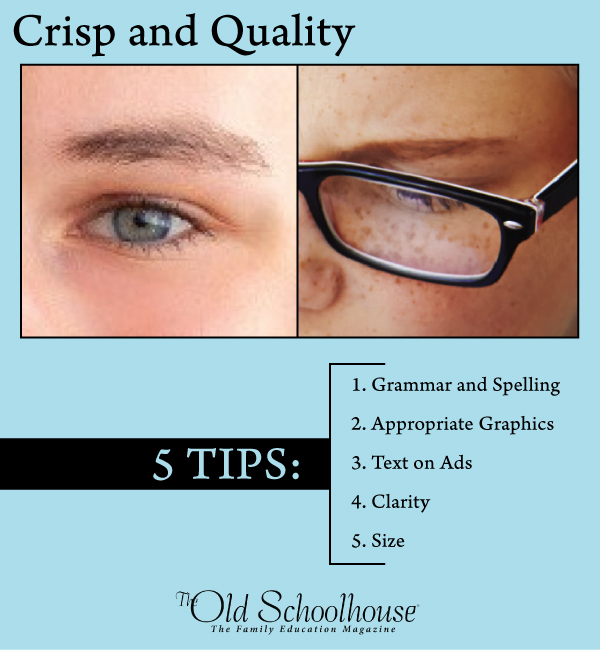
Resolution Example
The photo on the left is from an ad that got flagged by our printer’s scanning equipment that detects low quality images. I enlarged the ad to 400% focusing on the eye. You can see pixelization that will occur, and it would reproduce as blurry when printed. The image on the right is another ad where I did the same thing but notice how sharp it looks. It needs that sharpness to print properly. The image on the left has no sharp hairs or anything. You’re seeing it here on a screen, and that proves that the left image is not going to work.
Another issue is making sure that an ad at actual size will be readable, mainly in terms of text. For the Resource Guides, we show 3″x3″ graphics for each vendor, and once in a while we get one that looks so crammed and small in text, like they were trying to get too much in the visuals. It might be that they created a 900×900 pixel image graphic area (which at 300 pixels per inch is 3″ x 3″) and then worked on it at video screen resolution, which means it would be perhaps eight or nine inches tall on their screen—certainly not “actual size” for what it will be in the end.
What is good to do—and I do this whenever I’m designing a poster, large sign, or billboard— is to do the layout as if I’m looking at it from a distance so I consider its readability in its real environment. In the case of the Resource Guide graphic, they should reduce the size of their layout view so it represents 3″ x 3″ and think how this is going to look in print. Look at examples in the magazines and consider what is actually going to make an impact in this space.
Digital Quality
Susan Kramer is our Advertising Production Manager who receives all the ads sent to Artwork. Part of her job is to review all the ad components to ensure they are following the specs for the ad placement and appropriate for our audience. Here is a list of what she is looking for when graphics come in to Artwork:
- Grammar & Spelling: Making sure everything is spelled and formatted correctly.
- Appropriate Graphics: Any images that features low-cut tops or short-shorts are not acceptable and will result in being sent back to the advertiser.
- Text on ads: For certain platforms, like social media, graphics perform better with very little to no text on them. Enhanced Text Ads are limited to 15 words of text on the graphic.
- Clarity: Graphics that are clear and crisp are definitely more eye-catching than those that have pixelated images.
- Size: Graphics for social media should be sized according to the specs that are given in our media kit. Those are provided so that the ads will perform as well as possible on the various platforms.
The visual design of your ad will greatly affect the impact that it has on the audience that is viewing it. Will it create interest, or will it go unnoticed in the constant stream of other visuals that people consume on a daily basis?
These tips give you a solid foundation on how to create graphics to make your ad appropriate to publish, but you also need to design your graphics to make them stand out and get noticed. Our past article Web Banner Design Ideas has a short list of design tips that are also applicable to other types of graphic ads.
Have these marketing tips sent right to your inbox by signing up in the sidebar form.